Flex Wrap: Multi-line Magic!

TrashyMcTweak
This is RIDICULOUS! The client wants ALL 57 vacation photos displayed "nicely" on their website. What does "nicely" even mean?! Do I look like Martha Stewart?!
CodyMcTweak
We could, um, maybe use a table? That's what my free tutorials from 1997 suggested...


AllyMcTweak
Tables for layout? Really, Cody? Next you'll suggest we use <blink> tags and background MIDI music. *tosses hair* This is clearly a job for flexbox.
FattyMcTweak
Tables, flexbox, whatever—just stack 'em all in a premium lightbox gallery and charge extra for each swipe! *crumbs flying* Users LOVE paying per interaction!


GrumpyMcTweak
The PROBLEM is that these images are DIFFERENT SIZES! Put them in a flexbox without proper constraints and they'll OVERFLOW like EVERYTHING ELSE in this godforsaken digital hellscape!
CodyMcTweak
Overflow? Is that like when my free storage limit is reached and everything crashes?

AshleyMcTweak
Actually, we need a responsive layout per our contract. Section 12, paragraph 3 clearly states "Website shall display properly on any device from 320px to 2560px width." Signed in triplicate.
AllyMcTweak
Sounds like we need flex-wrap. Let the containers reflow based on available space.
TrashyMcTweak
REFLOW? Why stop there? Let's make the images DANCE ACROSS THE SCREEN! Let's add 3D ROTATION! Let's make them FIGHT EACH OTHER in a BATTLE ROYALE where only the prettiest photos survive!
GrumpyMcTweak
ONE. SIMPLE. GRID. That's ALL we need! No animations, no battle royale, NO SECURITY VULNERABILITIES!
FattyMcTweak
How exactly would dancing photos create security vulnerabilities?
GrumpyMcTweak
You'd be surprised what hackers can accomplish with an animated GIF these days. I've seen things... terrible things... *stares into distance*
GarbageMcTweak
Flexbox with flex-wrap. Simple container, reasonable sizing, let the browser handle the flow. Been solving this exact problem since 2015.
CodyMcTweak
But what about tables? My tutorial said—
Everyone
NO TABLES FOR LAYOUT!
CodyMcTweak
Sorry...
TrashyMcTweak
Fine, flex-wrap it is. But I'm adding hover effects that make the photos whisper compliments when you mouse over them!
GrumpyMcTweak
You will do NO SUCH THING.
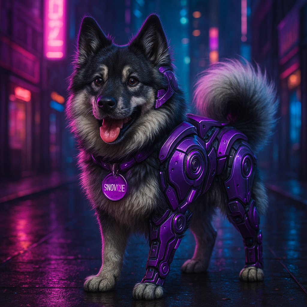
SnowzieMcTweak
*bounds into the room, accidentally sending photos flying everywhere*
AllyMcTweak
Oh no! Snowzie, careful with the—
SnowzieMcTweak
*slides across the floor, collecting photos in a surprisingly orderly pattern, then sits proudly next to them*
GarbageMcTweak
Look at that. Perfect grid with consistent spacing, naturally flowing to fit the available space. *pets Snowzie* She understands flex-wrap better than most developers.
SnowzieMcTweak
*happy bark, tail wagging*
FattyMcTweak
That IS a nice layout... Could we charge extra for that arrangement algorithm?
AshleyMcTweak
No, Fatty, we can't monetize an Elkhound's natural talent for organizing photos.
GarbageMcTweak
Let's code this up. Basic flex container, sensible item sizing, and flex-wrap to handle the flow. Clean, simple, effective.
SnowzieMcTweak
*barks approvingly, paws at keyboard*
GarbageMcTweak
Exactly. As Snowzie points out, we should add proper alt text for accessibility too.
CodyMcTweak
She said all that in one bark?
TrashyMcTweak
*whispering dramatically* The Elkhound speaks in code. It's terrifying and beautiful.
SnowzieMcTweak
*gives TrashyMcTweak a look*
TrashyMcTweak
I mean, let's start coding! Flex-wrap! Photo grid! No dancing images, got it!
Understanding Flex Wrap
Flex wrap is the secret sauce that allows flex items to flow onto multiple lines when they run out of space in their container. Without it, flex items would try to squeeze onto a single line, potentially shrinking or overflowing.
.container {
  display: flex;
  flex-wrap: wrap; /* Allows items to wrap onto multiple lines */
}
Values for flex-wrap:
- nowrap (default) - All items stay on one line, potentially shrinking or overflowing
- wrap - Items wrap onto multiple lines from top to bottom
- wrap-reverse - Items wrap onto multiple lines from bottom to top
Interactive Flex-Wrap Demo
Resize your browser window to see how the items automatically reflow based on the available space. Try different flex-wrap values to see how they affect the layout.
.container {
  display: flex;
  flex-wrap: wrap;
  gap: 10px;
}
Building a Responsive Image Grid
Let's create a responsive image grid that works on all device sizes. We'll use flex-wrap to allow images to reflow based on the available space.
Step 1: Set up the HTML structure
<div class="gallery">
  <div class="gallery-item">
    <img src="image1.jpg" alt="Description of image 1">
  </div>
  <div class="gallery-item">
    <img src="image2.jpg" alt="Description of image 2">
  </div>
  <!-- More gallery items -->
</div>
Step 2: Style the container with flex-wrap
.gallery {
  display: flex;
  flex-wrap: wrap;
  gap: 10px; /* Space between items */
}
Step 3: Style the gallery items
.gallery-item {
  flex-grow: 1;         /* Allow items to grow */
  flex-basis: 250px;     /* Base width before growing/shrinking */
  max-width: 400px;      /* Maximum width */
  height: 200px;         /* Fixed height */
  overflow: hidden;      /* Hide overflow */
  border-radius: 4px;    /* Rounded corners */
}

.gallery-item img {
  width: 100%;           /* Image fills container width */
  height: 100%;          /* Image fills container height */
  object-fit: cover;     /* Maintain aspect ratio but fill container */
}
The Result: A Responsive Image Gallery
Here's our responsive image gallery using flex-wrap. Resize your browser window to see how it adapts!
How it works:
- The gallery container uses
display: flexandflex-wrap: wrapto allow items to flow onto multiple lines. - Each gallery item has a
flex-basisvalue that determines its "ideal" width before growing or shrinking. - When the browser window is resized, items automatically reflow to new lines as needed.
- The
object-fit: coverproperty ensures images maintain their aspect ratio while filling their containers.
Common Flex-Wrap Challenges
Problem: Items Not Wrapping as Expected
/* This won't wrap because items will shrink to fit */
.container {
  display: flex;
  flex-wrap: wrap;
}

.item {
  flex-shrink: 1; /* Default value - allows shrinking */
  width: 300px;
}
Solution: Prevent Shrinking
.container {
  display: flex;
  flex-wrap: wrap;
}

.item {
  flex-shrink: 0; /* Prevents shrinking */
  width: 300px;
  /* OR use the flex shorthand */
  flex: 0 0 300px; /* grow shrink basis */
}
Problem: Uneven Row Endings
Sometimes the last row of your grid might have a few items that don't fill the full width, creating an uneven appearance:
Solution: Use flex-grow to Fill Space
Allow items to grow to fill available space:
.container {
  display: flex;
  flex-wrap: wrap;
  gap: 10px;
}

.item {
  flex: 1 0 200px; /* grow shrink basis */
  /* This says: grow to fill space, don't shrink below basis, start at 200px */
}
Build a Responsive Image Grid
Now it's your turn! Create a responsive image grid that reflows based on screen size. Follow these steps:
- Create an HTML file with a container and several image items
- Use flexbox with flex-wrap to create a responsive layout
- Style the images to maintain aspect ratio using object-fit
- Add hover effects to make the gallery interactive
<div class="photo-gallery">
  <div class="photo-item">
    <img src="image1.jpg" alt="Beach sunset">
    <div class="photo-caption">Beach Sunset</div>
  </div>
  <!-- Add more photo items -->
</div>
.photo-gallery {
  display: flex;
  flex-wrap: wrap;
  gap: 16px;
  padding: 16px;
}

.photo-item {
  position: relative;
  flex: 1 0 250px; /* grow shrink basis */
  height: 200px;
  max-width: 400px;
  border-radius: 8px;
  overflow: hidden;
  box-shadow: 0 4px 8px rgba(0, 0, 0, 0.2);
  transition: transform 0.3s ease, box-shadow 0.3s ease;
}

.photo-item:hover {
  transform: translateY(-5px);
  box-shadow: 0 10px 20px rgba(0, 0, 0, 0.3);
}

.photo-item img {
  width: 100%;
  height: 100%;
  object-fit: cover;
  transition: transform 0.3s ease;
}

.photo-item:hover img {
  transform: scale(1.1);
}

.photo-caption {
  position: absolute;
  bottom: 0;
  left: 0;
  right: 0;
  padding: 10px;
  background: linear-gradient(to top, rgba(0,0,0,0.7), rgba(0,0,0,0));
  color: white;
  font-weight: bold;
}
Best Practices & Tips
✅ Do
- Use flex-wrap when you want items to reflow based on available space
- Set a reasonable flex-basis for items
- Use gap property for spacing between items
- Include min-width constraints to prevent items from becoming too small
- Consider using flex-grow to allow items to fill available space
❌ Don't
- Forget to include flex-wrap (it's nowrap by default)
- Set fixed widths without considering flex properties
- Nest flex containers unnecessarily
- Forget about accessibility (images need alt text)
- Ignore mobile devices - test on different screen sizes
🚀 Performance Tip
For large image galleries, consider lazy loading images to improve performance:
<img src="image.jpg" alt="Description" loading="lazy">
Wrapping Up
Flex-wrap is a powerful property that makes creating responsive, multi-line layouts a breeze. Combined with the other flexbox properties we've learned so far, you now have the tools to create fluid, adaptable grid layouts for any situation.
AllyMcTweak
Remember, proper responsive design isn't just about making things look nice – it's about creating accessible, adaptable interfaces that work for everyone, regardless of their device.
FattyMcTweak
And the best part is that you don't need any premium plugins or expensive tools to create beautiful layouts. Flexbox is built right into CSS!
SnowzieMcTweak
*barks happily, paws at keyboard to commit the code*
GarbageMcTweak
Snowzie approves. The code is committed. Another responsive layout successfully deployed. Time to get back to Elden Ring.