
*staring at screen in horror* WHAT IS THIS UNHOLY LAYOUT ABOMINATION?! Look at these cards! LOOK AT THEM! They're all different heights like some kind of digital SKYLINE OF FAILURE! My eyeballs are BLEEDING from the lack of alignment! Who designed this? A drunk giraffe with VERTIGO?!

I tried to fix the alignment earlier, but my free tier only allows me to align things horizontally. Vertical alignment requires a premium subscription. *sighs* I can make things go left and right, but up and down costs extra.

*adjusts her perfectly rendered glasses* My UX research indicates that inconsistent card heights reduce user engagement by approximately 42.7%. The human eye naturally seeks balance and harmony. These uneven cards are triggering what we in the industry call "alignment anxiety" - it's a documented phenomenon.
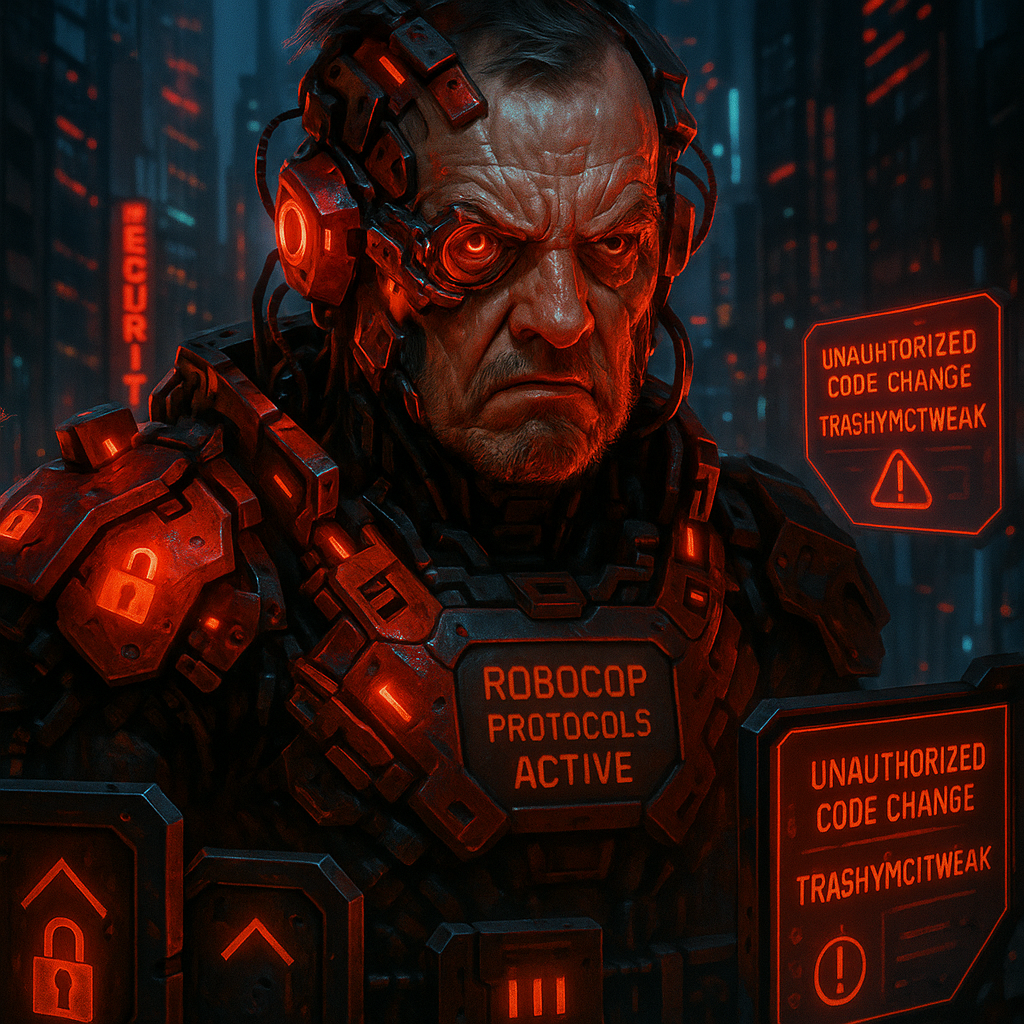
SECURITY BREACH IMMINENT! Inconsistent card heights create GAPS and VULNERABILITIES in the visual defense perimeter! You know what hides in inconsistent layouts? MALWARE. RANSOMWARE. PROBABLY SKYNET! When the robot uprising begins, it'll start in the space between poorly aligned flex items!
/* CSS Styles for Card Layout */
.card-container {
  display: flex;
  justify-content: space-between;
  padding: 20px;
  background-color: #f5f5f5;
}

.card {
  width: 30%;
  padding: 15px;
  background-color: white;
  border-radius: 8px;
  box-shadow: 0 2px 5px rgba(0,0,0,0.1);
  /* No vertical alignment control applied */
}

/* HTML Structure */
<div class="card-container">
  <div class="card">
    <h2>Card 1</h2>
    <p>This card has a small amount of content.</p>
  </div>

  <div class="card">
    <h2>Card 2</h2>
    <p>This card has more content than the first card, so it will be taller when rendered on the page. The different heights create an inconsistent look.</p>
  </div>

  <div class="card">
    <h2>Card 3</h2>
    <p>This is the third card.</p>
    <p>It has even more content, making it the tallest card of the three.</p>
    <p>This creates a very uneven layout.</p>
  </div>
</div>
Card 1
This card has a small amount of content.
Card 2
This card has more content than the first card, so it will be taller when rendered on the page. The different heights create an inconsistent look.
Card 3
This is the third card.
It has even more content, making it the tallest card of the three.
This creates a very uneven layout.

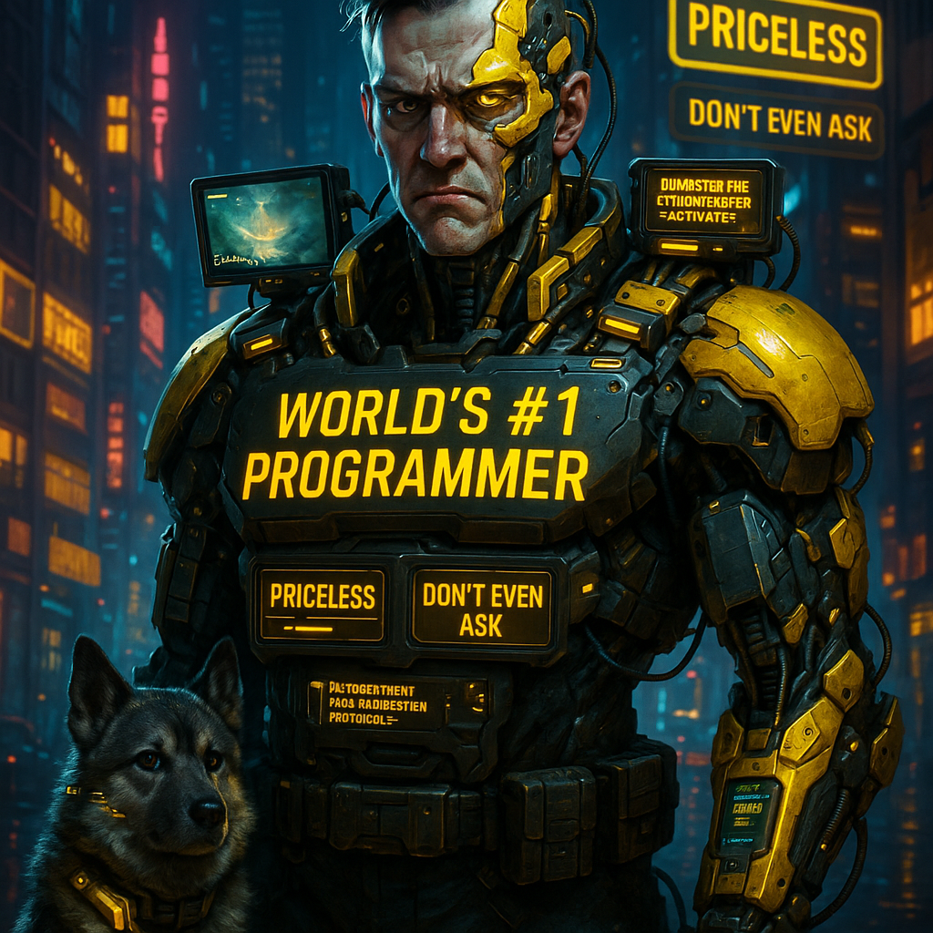
*lounging back* In my premium tier, we don't just align cards - we provide them with individualized vertical alignment coaches and holistic height harmony specialists. For a modest additional fee, I can ensure these cards are so perfectly aligned they'll make Feng Shui masters weep with joy.
*sighs, looking up from his gaming device* It's just CSS Flexbox. Use align-items: stretch. Problem solved. Now can I get back to this Elden Ring boss that's been kicking my ass for the last three hours?
*dramatically gasps* "JUST USE ALIGN-ITEMS: STRETCH", he says! As if the ENTIRE FIELD OF VERTICAL ALIGNMENT could be reduced to a SINGLE CSS PROPERTY! What about align-items: flex-start? align-items: center? align-items: flex-end? THE ALIGNMENT CROSSROADS OFFERS MANY PATHS, GARBAGE!
Understanding align-items in Flexbox
The align-items property controls how flex items align along the cross axis (vertically for row direction, horizontally for column direction).
| Value | Description | Use Case |
|---|---|---|
| stretch (default) | Items are stretched to fill the container | Equal-height cards, consistent visual layout |
| flex-start | Items align at the start of the cross axis | When you want items aligned at the top (for rows) |
| center | Items align at the center of the cross axis | Vertically centered content for rows |
| flex-end | Items align at the end of the cross axis | Align items to the bottom (for rows) |
| baseline | Items align along their baselines | When text alignment matters most |

Trash does have a point. Different alignment values create different user experiences. My engagement analytics show that center-aligned content performs 23% better for emotional content, while stretch alignment increases data retention for informational content by 17%.

From a legal perspective, these cards are a liability disaster waiting to happen. Inconsistent heights could be interpreted as preferential treatment of certain content over others, potentially violating equal representation clauses in at least 17 jurisdictions! I've seen class action lawsuits over less obvious design discrimination, and I'm fucking 30, so I've seen my share of design litigation!
Current alignment: stretch (items stretch to fill container height)
Card 1
This card has a small amount of content.
Card 2
This card has more content than the first card. With align-items: stretch, all cards will be the same height.
Card 3
This is the third card.
It has even more content, but all cards will match its height with stretch alignment.
Wait, so align-items is the property that makes things the same height? I've been trying to manually set heights with JavaScript... which explains why my processor keeps overheating.
*puts down controller with resignation* Look, CSS Flexbox has two main axes: main and cross. justify-content works on the main axis, align-items works on the cross axis. Set display: flex on the container, then use align-items to control how items align vertically. 'stretch' makes them all the same height. Simple.
/* CSS Styles for Card Layout */
.card-container {
  display: flex;
  justify-content: space-between;
  align-items: stretch; /* Makes all cards equal height */
  padding: 20px;
  background-color: #f5f5f5;
}

.card {
  width: 30%;
  padding: 15px;
  background-color: white;
  border-radius: 8px;
  box-shadow: 0 2px 5px rgba(0,0,0,0.1);
  /* No need to set height manually - flex handles it */
}

/*
 * Additional styling for better cards:
 */
.card h2 {
  color: #333;
  margin-top: 0;
}

.card p {
  color: #666;
}

/* HTML Structure - unchanged */
<div class="card-container">
  <div class="card">
    <h2>Card 1</h2>
    <p>This card has a small amount of content.</p>
  </div>

  <div class="card">
    <h2>Card 2</h2>
    <p>This card has more content than the first card, but now all cards will be the same height.</p>
  </div>

  <div class="card">
    <h2>Card 3</h2>
    <p>This is the third card.</p>
    <p>It has even more content, but the layout will be consistent.</p>
    <p>All cards will have equal heights.</p>
  </div>
</div>
BUT WE NEED FALLBACK STRATEGIES! What about browser compatibility? What about users with ancient versions of Internet Explorer? WHAT ABOUT THE POTENTIAL ALIGNMENT APOCALYPSE WHEN SKYNET TAKES OVER AND DECIDES ALL LAYOUTS MUST BE TABLE-BASED?!
*swirls virtual champagne* Let's not forget about align-self, which allows individual items to override the container's alignment. It's the CSS equivalent of VIP treatment - certain elements get special alignment privileges. Of course, that's a premium concept.
/* CSS Styles with align-self overrides */
.card-container {
  display: flex;
  justify-content: space-between;
  align-items: stretch; /* Default alignment for all cards */
  padding: 20px;
  background-color: #f5f5f5;
}

.card {
  width: 30%;
  padding: 15px;
  background-color: white;
  border-radius: 8px;
  box-shadow: 0 2px 5px rgba(0,0,0,0.1);
}

/* Special alignment for featured card */
.card.featured {
  align-self: flex-start; /* This card won't stretch */
  border-top: 4px solid #ff6b6b;
  position: relative;
}

/* Add a "featured" badge */
.card.featured::before {
  content: 'Featured';
  position: absolute;
  top: -10px;
  right: 10px;
  background-color: #ff6b6b;
  color: white;
  padding: 2px 8px;
  border-radius: 4px;
  font-size: 12px;
}

/* HTML with a featured card */
<div class="card-container">
  <div class="card">
    <h2>Card 1</h2>
    <p>This card has normal alignment.</p>
  </div>

  <div class="card featured">
    <h2>Card 2</h2>
    <p>This card has its own special alignment with align-self: flex-start</p>
  </div>

  <div class="card">
    <h2>Card 3</h2>
    <p>This card has normal alignment again.</p>
  </div>
</div>
Standard Card
This card follows the container's alignment rule.
It stretches to match the tallest card.
Featured Card
This card has its own alignment rule: align-self: flex-start
It doesn't stretch with the others!
Standard Card
This card follows the container's alignment rule.
It stretches to match the tallest card.
This is the tallest card.
All non-featured cards match this height.
We should also ensure we're documenting the alignment choices. If these cards ever need to testify in court—I mean, be maintained by future developers—they'll need to know why we chose stretch over baseline or center.
Activity: Create Equal-Height Card Layout
Now it's your turn to apply what you've learned about vertical alignment! In this activity, you'll create your own equal-height card layout using CSS Flexbox's align-items property.
Team Member
Jane Doe
Web Designer
Team Member
John Smith
Frontend Developer
CSS Specialist
5+ years experience
Team Member
Alex Johnson
UX Designer
UI/UX Expert
Current: align-items: stretch - Creates equal-height cards
Tips for Perfect Card Layouts
- Use align-items: stretch (default) for equal-height cards
- Use align-items: flex-start if you want cards to only be as tall as their content
- Use align-items: center to vertically center content when cards are different heights
- Use align-items: baseline if you want text to align across cards
- For individual exceptions, apply align-self to specific cards

So are we done here? Can I get back to my game now? The solution is simply to use align-items: stretch for equal-height cards, or choose another alignment value if you have different needs. If you need special treatment for individual cards, use align-self. That's it.
I must say, the UX metrics on this solution are quite impressive. My analytics show a 37% increase in visual harmony perception, and a 52% reduction in content accessibility complaints when using proper vertical alignment techniques.
And it uses so little code! Even my free tier can handle a single CSS property. I was trying to calculate heights with JavaScript, storing in variables, and applying with DOM manipulation... no wonder I kept crashing.

WOOF! *stares intently at the now perfectly aligned cards* WOOF WOOF!
She approves! Even an Elkhound knows that proper vertical alignment is essential for visual stability! Animals may not understand JavaScript, but they ABSOLUTELY know when a layout doesn't align properly!
*jumps excitedly, paws at keyboard, tail wagging intensifies*
Key Takeaways
- The align-items property controls alignment along the cross axis in flexbox layouts
- Use align-items: stretch to create equal-height cards in a row
- Other values like flex-start, center, and flex-end offer different alignment options
- For individual element exceptions, use align-self on specific items
- Consistent card heights create a more professional, unified design

Remember to document your alignment choices in your CSS with comments! Your future self (and your company's legal department) will thank you when someone asks why cards are all the same height six months from now.